Titles and Credits Research
The opening titles for the Ellington kid are really plain and simple. The genre for this short film is dark humour, we can sort of tell this through the titles simplicity but we can also tell this as the colour of the font is white, in addition it is placed on a contrasting black colour which would be making the which titles be more visible to the audience, furthermore it could get the audience to make assumptions to what what genre the short film would be. Due to the layout and colouring of the opening titles.
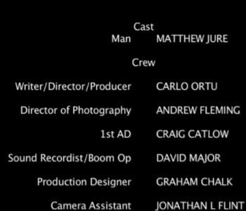
The points which I have made about the opening titles also pay a large toll in the ending credits of the short film as they are really plain however we can see that the rolls of everyone in the cast and production line is fairly thin however their names are fairly bold which could only mean that it is showing importance to the cast and crew. This could also signify that the rolls on the creation were not important and that they were even I say this as there were no names of cast or crew shown in the opening titles however they were all shown in the closing credits of the short film.


The Ellington Kid
Mateusz Starak
On this page, you will be able to find the research and analysis which we have made to do with the titles and credits for the short film. We also did research on the titles for the genre which we have chosen to make our short film in.
The following titles and credits have been take from short film, Nadia. Its about a girl has been left alone by her mother and kicked out of the house.


These are the credits from NADIA (2017). Its shows all of the casts real names and their cast names. This signifies to the audience which character is who. This can build up a high reputation for the actor or actress if they perform well in the film. It also shows footage taken from the characters phone to show the characters in a lighter mood or may behind the scene of the short film. This could be incoorporated into our film because it would give the audience a sense of emotion for them to connect to. Furthermore, the font of the real name of the characters to make it easier for the audience to distinguish the difference between the character name and real names.
In our film, we aim to give awareness messages with facts and statistics our mental health to show the audience the issues that young people with mental health face and also the help that people affected with this can recieve from helplines or speaking out. In NADIA, they showed the phone line and two websites that offer help with mental health. The font used appears to be arial. Arial is a font that is very clear to see and therefore makes it easier for the audience to read the writing.
Lastly, the editor added facts and statistics into the credits. This creates and emotional connection with the audience. The fact states that 150,000 young people are at risk of being homeless. To the audience this would come as a shock and would have them talking about it and therefore more likely to act on the information given.

For The Birds
For the birds is animation film about birds that are sitting on a electricity wire. The first picture that is presented is this screenshot shown here. Pixar is a film production company that produces animated films generally aimed at children and younger audience. Pixar also have links Walt Disney a big conglomerate in the film industry. When the audience sees this title, they should have an idea of the type of the film their watching.


This is the main title of the film. As you can see, the font used is a bold rounded font. This could signify a childish theme. The audience could connote that the film is based or aimed at children. Furthermore, the words 'for' and 'the' are not straight. This could signify that the title could have been written by a child hence why the title isn't straight. However, it could also represent the electricity wire that features in the film as it curved. In addition, the title can be seen as informal because there are no capital letters or formal structure. This relates to the childish theme of the film. Lastly, the colour of the title is blue and white. The audience can tell that the background is the sky. However, as meaning of colours blue signifies tranquility and detpth. This means that the colours make the audience feel comofortable before watching the film. The white represents innocence which is a neutral feeling.
This is the ending title. It clears tells the audience that this part is the end of the film. Once again, the same font, size and structure is used. This keeps with the theme of childish. Also, in the background it is black and has a splat of white. The black in contrast to the blue means that the mood of the film has changed from being calm to dark and unknown. The white patch appears to paint as if a child has been drawing.

This is the opening title of the film About A Girl(2001). About a girl uses a font and typeface that audiences associate with younger generations and modern technology of text messaging.The opening title for About a girl is quite simple as it is white on a contrasting background which makes it visible for the audience.This contrasting signifies to the audience the genre that this short film is (drama). This connotes the difference between the protagonists dreams and reality.
The actors names are bolder than the character they played which attracts the audience's attention.This is good as it signifies that they’re trying to get the actors some recognition.This connotes that the actors are more important.


About a girl
Arnold Garry-Plinton
This title is taken from the CGI Animated Short film spellbound.
The font signifies the narrative of the short film includes ink.

The directors names are the biggest on the screen.This signifies the level of importance of the cast. The name of the cast are in a bigger font than the role they played in the production of this short film. This signifies that they’re trying to get them noticed. The roles they played are also in a darker colour than their names which also signifies them trying to get noticed as it is less visible due to the background being black.

Arnold Garry-Plinton
The credits refer back to the opening title which means that the audience leaves with a lighter mood of satisfaction due to the colours of white and blue. The black font writing make it easy to read. The role of the crew is bold whilst the name arent. This shows priority of the role over the name. This are seen as more important.


The following short film that i have analysed is a CGI animated short film called 'Spellbound'. The credits shown here show the filmers, music and sound person. This is the first of a slide of credits. Most credits show the cast first however because this is an animated film there are not cast. Therefore, the people that filmed the film are the main cast for it as they planned out and were involved in producing it. This also means that all the main people involved in the film to produce it are shown first. The font used in is this shot isn't very straight and formal, it seems playful and aimed more for children. This could signfy that the target audience of the film is children.
Lastly, the last page of credits shows all of technical appreciation for the film making. From this the audience knows that the hardware used were HP workstations and the software like adobe photoshop which can be easily accessible was used to produce the film. In addition, the special thanks section mentions anyone who contributed to the film indirectly either physical or mentally. Its easily distinguished due to the layout of each section.
The next shot shows where the film was produced and more information of the production team. The credits have been colour coded to make it easier for the audience to read. The audience is instantly attracted to the colour first to see what the role is and then the person's name underneath. This is because the role the person took part in is more important than who they are. Many famous producers are famous for being producers rather than famous for their names. Furthermore, the college that produced the animation has been made bigger than the rest of the font. This may have been done to partly advertise their company and for recognition from the audience of who they are.
Steven Assuncao
Steven Assuncao
Steven Assuncao
This is The title is sort of plain as it is typical contrasting colours but it’s not a typical title as every letter is a capital and the letters are all different sizes. This signifies that the narrative of this short film starts off as a typical short film but then a twist occurs.
The actors names are in capitals and the character the actors played are not. This makes the actor's name seem bigger and stands out more. This signifies the respect the actors get, trying to get them recognition.


This short film is called Two and Two. In summary, it's a drama of teacher teaching his pupils that two add two is five. It appears the teacher is forcefully re educating his pupils to learn this new strict regime. Evidently, this is incorrect however one pupil objects and says it equals four. He gets killed for it which can also be seen as dark humour. The film is filmed in a classroom with diagetic sound of foreign speaking characters signifying its a foreign short film.
This picture shown above are the introducing titles to the short film. The first thought is that the titles represent chalk on a blackboard. This signifies that the film may have something to do with a classroom setting. This can also can connote social economic difficulties as this method of teaching is often referred to poor economies or old fashioned methods. The geometry of the writing also are different to standard english font. For example, 'w' is shaped differently which could correlate to the foreign theme. Furthermore, there is a translation for two and two beneath to suggest an Arabic or Persian language.
The credits have a more simplistic font size and shape which is easier to read. This screenshot shows all of the cast in the film. The same font has been used throughout the credits which signifies continuity and equal status.
The credits have a more simplistic font size and shape which is easier to read. This screenshot shows all of the cast in the film. The same font has been used throughout the credits which signifies continuity and equal status.
Steven Assuncao
Arnold Garry-Plinton

